Duration: 2 weeks | Individual Work
Tools: Adobe Illustrator | Adobe XD | Invision
Role: Responsible for research and redesign of this website (Mobile version)
Case Study | Penny Juice - Juice Purchase for Children App
*This case study may contain copyrighted material the use of which has not been specifically authorized by the copyright owner. This case study has helped me to promote my capabilities and advance my education specifically in the area relating to user experience (UX) research and includes my personal opinions, satire, criticism and review. I believe this constitutes a "fair use/dealing" of any such copyrighted material.
📖 Research | 👩🦰 Persona | 🗺️ Journey Map | 📱 Wireframe & Mockups | 👁️🗨️ Peer Evaluation via Invision
01 The Brief
I am a BCIT New Media Design student. In order to have a deeper understanding of the process of UI/UX design, I chose a website that has potential for redesign. I have recorded all my design processes and thoughts.
The website I chose is "Penny Juice" which provides 100% blended fruit juice concentrate specifically designed for childcare centers. I intentionally expanded the consumers to individual families, because individual families have similar care and concerns about juice quality. This makes it essential for the site to be redesigned. Here are the steps I went through along with my reasoning.
⋅ Do competitive research to learn more about the industry.
⋅ Build a user persona. It helped me build empathy towards the user.
⋅ Make a user journey map to define the target user's needs and pain points.
⋅ Sketch a wireframe to better visualize suggested improvements.
⋅ Make a mobile app mockup to provide better visual clarity.
⋅ Perform user testing to get classmate feedback and mockup improvements.
02 Research
First, I analyzed Penny Juice's website carefully to better understand its features and goals. There are only 3 pages in total: Home page, Product page and Order page.
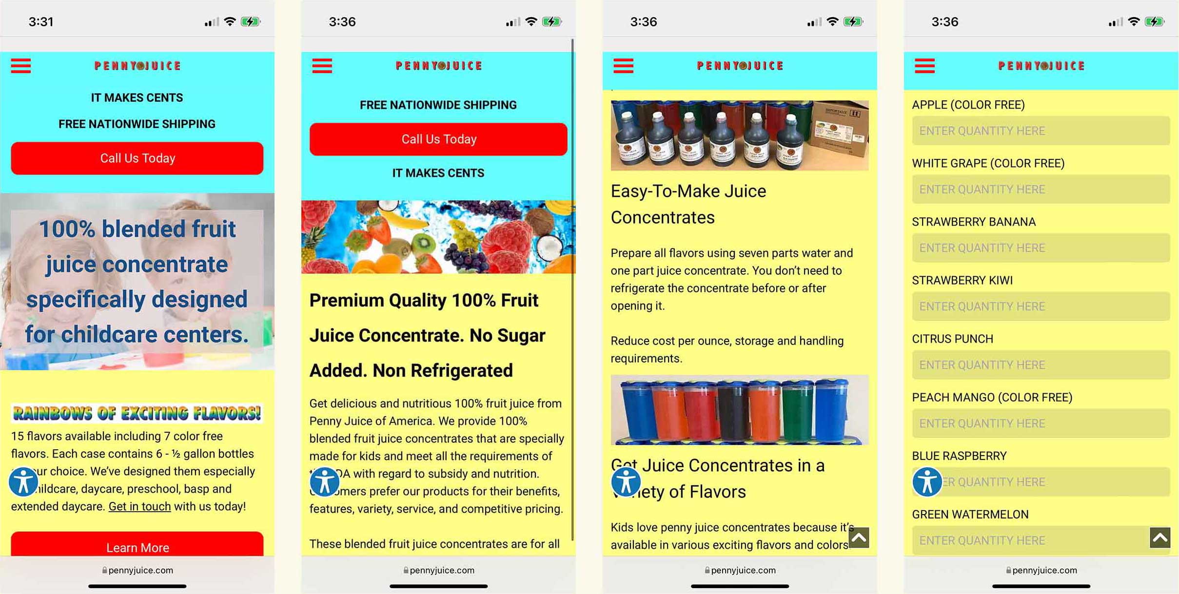
Observations of Penny Juice's website:
⋅ The colors are too bright and they hurt my eyes.
⋅ The website is not professional looking, and it lacks credibility.
⋅ Product bottles do not look attractive, and the juice colors are unnatural.
⋅ The quantity that customers can purchase is inflexible. Customers have to type in quantities manually and does not include unit measurements. The minimal order is 1 case (6-1/2 gallons).
⋅ The product pages do not include any customer reviews or nutritional information about the juices.
⋅ The order form has no price, no image, and it is difficult for customer to decide the combination they want. Other issues include no information about delivery frequency or delivery date customization.
Competitors Observations:
⋅ Most online juice websites are clean and simple with a strong focus on clean labels and colorful imagery.
⋅ Some of the online websites categorize their products based on the functinality of the juice.
⋅ Customers can check reviews of each product, and choose the size and quantity of the juice.
⋅ Most websites included a small information section about the benefits and ingredients of the featured juice.
⋅ Some online stores allow customers to choose the order frequency, and offer automatic quantity discounts.
Website Goals:
⋅ Beautiful and clear presentation of their products, simple and without losing necessary information.
⋅ Build trust and make customers want to buy their products.
Customer Goals:
⋅ Find good quality and tasty juice for their family or organization.
⋅ Purchase juice at custom frequencies.
Next step is to analyze the user task, create a user persona to help define the target user, and to create a user journey map to define pain points and opportunities for improvements.
03 Define Target Users
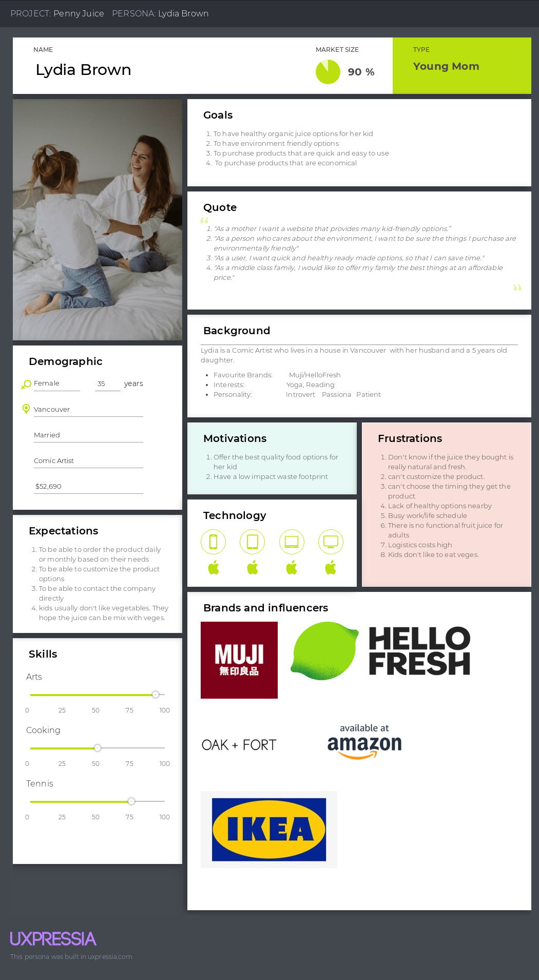
Persona
In UX design, the persona is used to articulate the ideal user. In this case, the ideal user of this website - A mother. Specifically, we are trying to group these users into archetypes who represent a group of users that this website should be marketing to. For me, I want to get to know these users, empathize with them, and understand what they want out of their website shopping experience.
User Journey Map
User journey map helps us to better understand our ideal user's behavior and problems and define their pain points and opportunities. Through this tool, we can understand the user's feelings, their joys and frustrations, and their needs at every step of the customer journey, and to even create needs. Using this we can effectively improve the performance of the existing website.
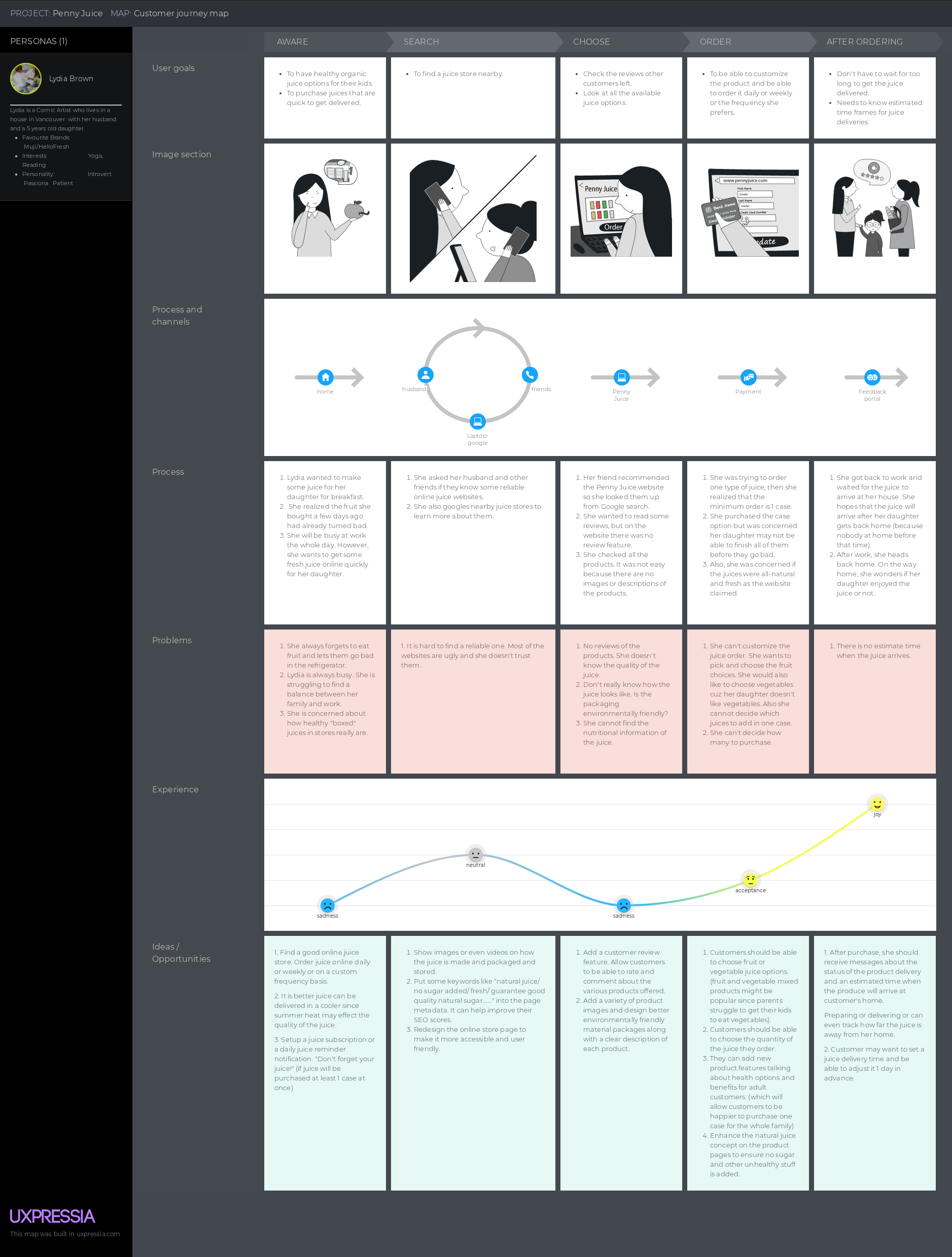
Pain Points and Solutions
#1 No trust being built.
Based on the first rule of the UX Law - "Users often perceive aesthetically pleasing design as design that's more usable." Visually enjoyment is the first thing I focus on, and it is also the easiest and most efficient one. I am going to choose one main website color to create a soothing feeling for users. Then I want to emphasize that the juice is all natural, without any added chemicals or sugar. Also, I will add a video to inform the user about the production and storage process of the juice (add expertise). Finally, I want to include user reviews (add trustworthiness).
#2 Customers cannot customize the product.
These days, product customization is important since every user has their own unique needs. Standing out while meeting the needs of individual customers is vital. In this regard, I will make some improvements as follows: the ingredients, nutrients, and benefits of each bottle of juice concentrate will be listed in detail. Users can easily choose their products, decide their juice combination and quantity as well as the order frequency. What's more? Instead of only providing juice to children, how about providing juice to adults too?This would make users likely to purchase more juices in a single order. Another idea would be to add vegetable juices as an alternative option considering how parents struggle to get their children to eat vegetables.
#3 Hard to track their product after purchasing.
We should be able to send users a message or email when their juice is being delivered. And users can choose which timeframe they prefer to get the juice: morning, afternoon or evening, and the date can be adjusted 1 day in advance.
04 Visualize
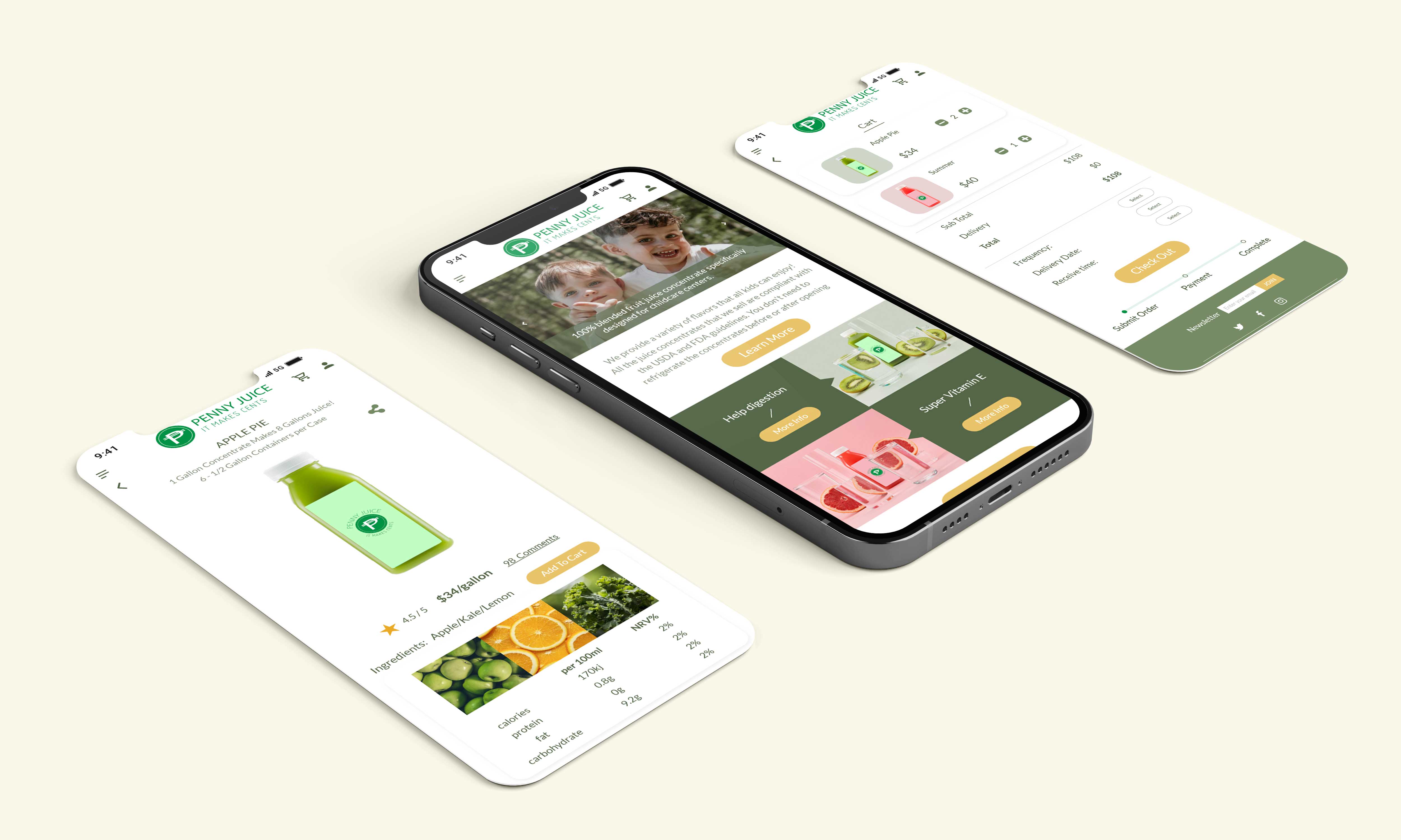
After all the work done above. I started to wireframe the main screens.
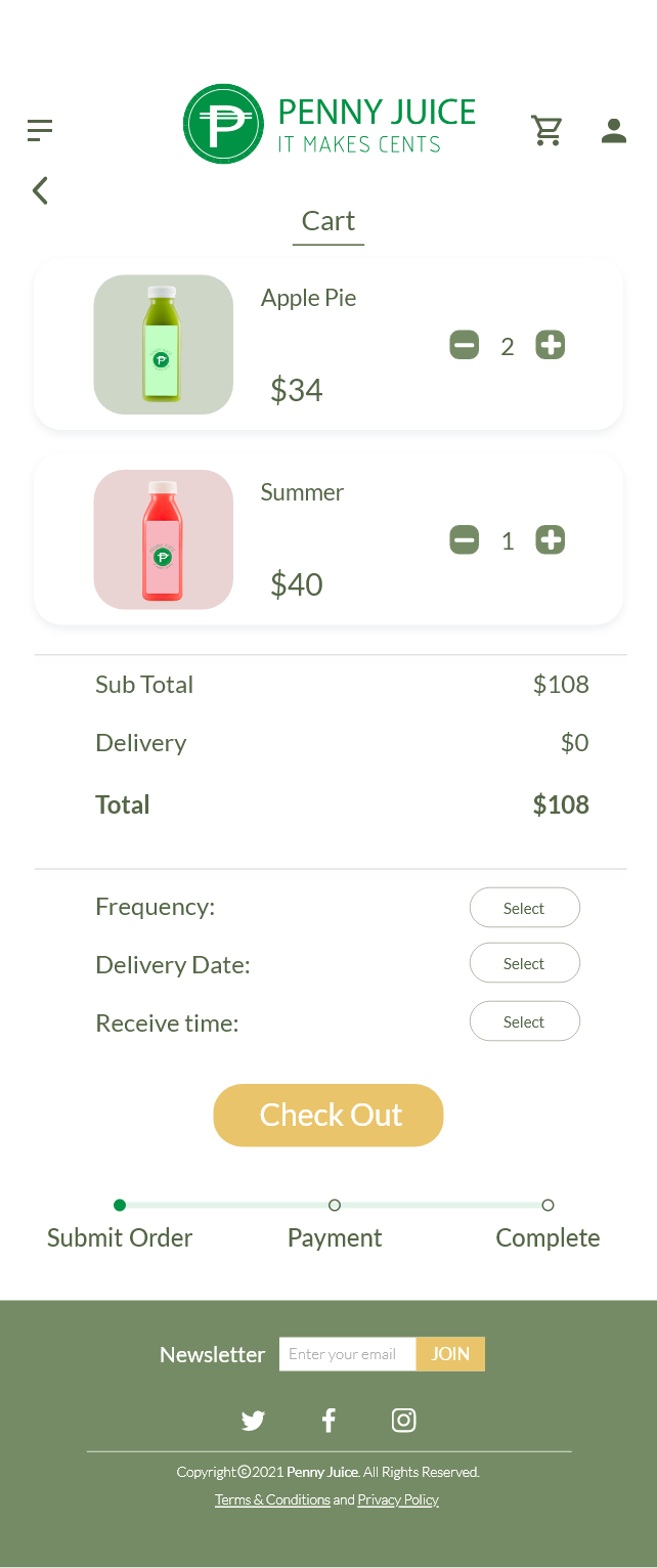
Homepage - Products Page - Individual Product Page - Check Out Page
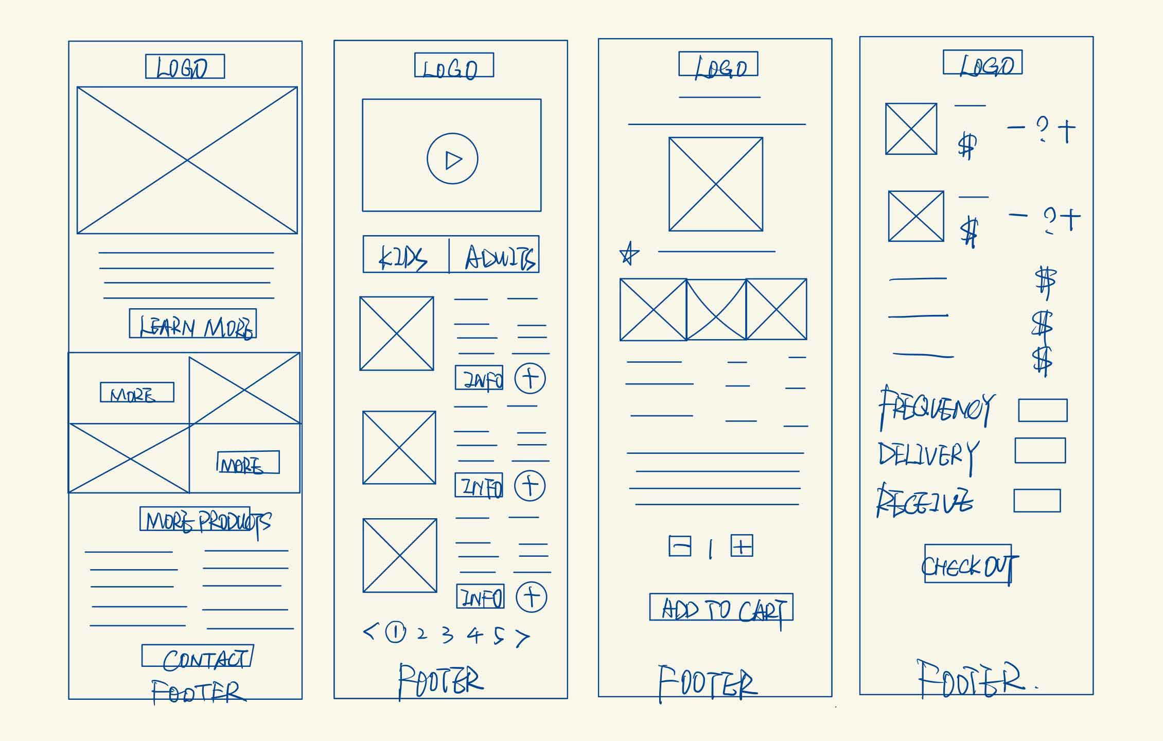
I referred to the principles of interactivity and the laws of UX to create my mockups of the Penny Juice app. I focused on key aspects including discoverability, simplicity, affordances, and ease.
Insights
⋅ Homepage: Compared to the old site, the new home page added Penny Juice's featured products, as well as user reviews which build trust.
⋅ Products Page: The old site does not have a product page. I added this page for customers to get more information about all the categorized products. This would allow customers to customize their orders.
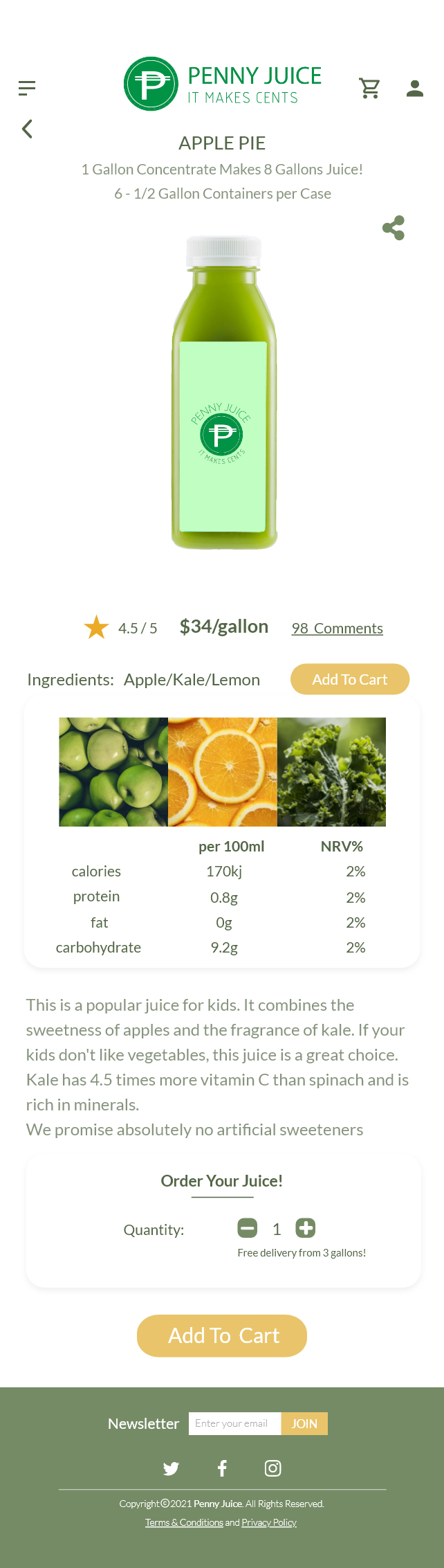
⋅ Individual Product Page: The old site does not have this page either. I added it to show customers nutritional information about the juice which creates credibility.
⋅ Checkout Page: Customers can edit the quantity of the juice and choose the frequency/delivery date/receive time.
05 Peer Evaluation Prototype via Invision
After I finished my HiFi mockups, I imported these 4 screens into Invision for further testing. I got some feedback from my classmates for more improvements.
PS: Invision is a prototyping tool. It allows designers to quickly create interactive mockups and share with team members or clients to get feedback.
🔅Meesh: It could be nice to have "Add to cart" button in products page, so that people who know what they want to order don't have to go into the "more info" page to do that.
🔅Eleanor: This might be my computer, but I am having a hard time reading the finer fonts. I might suggest making them slightly bolder or darker in color so that they are easier to read.
🔅Kellee: Add to cart button could be a little bigger
🔅Bryce: Maybe add one of these buttons to the top of the page, so that customers don't have to scroll. :) Sell that juice!!
🔅Sue: I like the colours you chose. I think green and dark yellow are suitable for this organic juice company! and I also like the detailed information of the product :) Maybe using (-) (+) buttons for products quantity, rather than text box can be another option? I guess it might be easier for users to use
🔅Kristy: Well design and the site looks so organized, you put just right amount of info you put in each page. Also, you should adding a price tag above or below the quantity. :))
Here Is The Final Result!
06 Reflection
This case study gave me a better understanding of user-centered design and to remember the saying "always keep the user's needs and pain points in mind!". Moreover, I learned how to provide more comprehensive information in a simpler design aspect.
The most important tools I used in this case study are user journey map and Invision. The former allowed me to experience the website as a customer and think about the problems from the user perspective. The latter allowed me to test my design further and visualize the connections between each screen. UX design is definitely not an easy thing because it requires us to focus on being comprehensive and highly detailed. This will be a good starting point for me to learn UI/UX design.
Other Projects